If you run an online store and are wondering how to increase ecommerce sales, you probably already know the sinking feeling that comes with seeing your cart abandonment rate.
But you’re not alone. Did you know that nearly 70% of online shopping carts are abandoned before completing a purchase?
It’s a staggering statistic that sheds light on the critical importance of the checkout experience in the world of e-commerce. Think about it: Customers who have spent time precious time browsing, comparing products, and finally making a decision, are deterred simply by a cumbersome checkout process. This scenario is all too familiar for many online shoppers, and it underscores just how crucial it is for businesses wondering how to increase ecommerce sales, to optimize their checkout process to maximize sales.

In today’s digital age, where consumers have countless options at their fingertips, the checkout experience can make or break a sale. It’s the final hurdle in the buyer’s journey, and if not executed properly, it can lead to frustration, hesitation, and ultimately, abandonment. But why is the checkout experience so significant? And how does it influence consumer behaviour? Let’s unravel the mysteries behind the checkout experience, and find out how to increase ecommerce sales by making simple alterations!
The Importance of the Checkout Experience
Imagine a scenario where a customer has added items to their cart, ready to make a purchase. But when they reach the checkout page, they’re greeted with a lengthy and confusing form, unexpected shipping costs, or a lack of payment options. Frustrated and discouraged, they abandon their cart and take their business elsewhere.
Conversely, a seamless checkout experience can instil confidence and trust in your brand, making customers more likely to complete their purchase. Convenience, security, and trust are key factors that play into this. Customers want a checkout process that is quick, easy to navigate, and secure. They want to feel confident that their personal and payment information is safe, and that they can trust your store to deliver on its promises.
Let’s explore the success story of Amazon’s “Buy Now” button optimization. By strategically redesigning and prominently featuring the “Buy Now” button throughout their website, they significantly streamlined the purchasing journey for customers. This simple yet impactful change resulted in a substantial increase in conversions and sales for Amazon. Customers appreciated the effortless checkout experience, leading to higher satisfaction and repeat purchases. Little changes like these have paved the way for Amazon to solidify its position as a leader in e-commerce and set a new standard for online checkout optimization.

The Psychology Behind Consumer Decision-Making
Deciphering why customers hit that “buy now” button is like unlocking a treasure trove for online businesses. It’s delving into the captivating realm of psychology – from those clever mental hacks to the instincts that make us say, “I’ll take it!” These elements aren’t just minor details; they’re the secret sauce that decides whether we indulge in a purchase or abandon our virtual shopping cart.
Let’s look at 3 crucial psychological factors you should consider if you’re wondering how to increase ecommerce sales.
Cognitive biases
Cognitive biases are systematic patterns of deviation from rationality in judgment, where individuals create their own “subjective reality” based on their perceptions and beliefs.
In the context of online shopping, cognitive biases can influence how customers perceive products, prices, and the overall shopping experience. For example, the anchoring bias occurs when customers rely heavily on the first piece of information they receive when making a decision. Ever opened an ecommerce website and the first thing you see is a posh, expensive item? Seeing this, you form judgements about the prices of other items on the website, but subsequently find that they are cheaper in comparison.
That’s the anchoring bias in action. Your brain latches onto that first price you see and uses it as a reference point for everything else. So, even if there are cheaper options down the line, that initial high price sets the tone, making those other prices seem more reasonable in comparison. Online retailers know this trick and often use it to sway our perceptions.
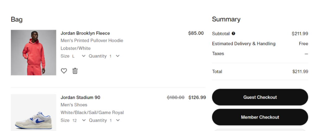
You can use anchoring bias in your checkout process as well! Strategically place a high-value item first in the checkout process, influencing customers’ perceptions of subsequent costs.
Emotional triggers
Emotions play a significant role in driving consumer behavior, often leading individuals to make impulsive purchasing decisions. Online businesses can tap into these emotional triggers by creating a sense of urgency or scarcity, fostering a feeling of exclusivity or belonging, or appealing to customers’ aspirations and desires. Here’s how you can leverage emotional triggers too:
- Limited-time offers
- Countdown timers
- Personalized product recommendations

These tactics can evoke a range of emotions, from excitement and anticipation to the fear of missing out (FOMO). They work like a charm, pushing customers to complete their purchase before the countdown expires. It’s a strategic play on human psychology that keeps us on the edge of our seats, compelling us to act swiftly.
Social proof
Social proof refers to the psychological phenomenon where people assume the actions of others in an attempt to reflect correct behavior in a given situation. Here’s how social proof can manifest itself in the context of online businesses:
- Product reviews
- Ratings
- Testimonials
- User-generated content.

Social proof is like getting a friendly nod from a trusted friend, reassuring you that you’re on the right track. Smart online retailers understand the importance of showcasing these positive reviews and ratings, not just to sell a product, but to build trust and confidence in their brand. After all, nothing speaks louder than happy customers sharing their experiences.
Factors That Enhance the Checkout Experience
User interface design:

User interface design is like the silent conductor of the checkout symphony, orchestrating a seamless journey for customers. Think of it as the blueprint for a well-designed house – every element meticulously placed to guide visitors effortlessly from cart to completion. With clear navigation and strategically positioned call-to-action buttons, online retailers create a user experience that feels like a smooth ride on a well-paved road.
Simplicity and clarity:

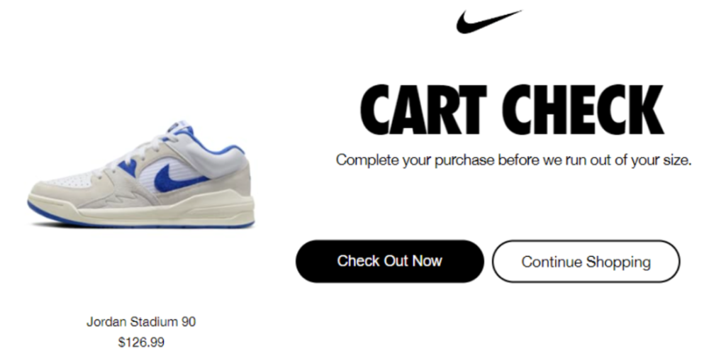
Simplicity stands as the cornerstone of an effective checkout process. Complex forms, unnecessary steps, and unclear instructions can all create friction and lead to abandoned carts. By refining the checkout experience to offer straightforward steps and crystal-clear directions, businesses can dismantle these obstacles and elevate conversion rates. The goal is to ensure that every interaction propels customers smoothly toward finalizing their purchase, devoid of unnecessary complications. The Nike checkout page above, is the perfect example of design simplicity, and it shows just what is required to the prospective customer to finalise the purchase. By adopting this simple approach, businesses can learn how to increase ecommerce sales drastically.
Mobile optimization:
With the rise of mobile shopping, optimizing the checkout experience for smartphones and tablets is no longer optional – it’s essential. Mobile-friendly design ensures that customers can easily navigate the checkout process on any device, without sacrificing functionality or speed. From responsive layouts to mobile-specific payment options, prioritizing mobile optimization is crucial for catering to today’s on-the-go shoppers.
Multiple payment options:
Offering a variety of payment options gives customers the flexibility and convenience they crave. Whether it’s credit/debit cards, digital wallets, or alternative payment methods like PayPal or Afterpay, providing multiple ways to pay accommodates diverse preferences and increases the likelihood of a successful transaction. By catering to a range of payment preferences, online retailers wondering how to increase ecommerce sales, can remove barriers to purchase and capture a broader audience.
For a simple, secure payment gateway, check out PaySprint. We have a no-frills, subscription-based model that allows you to receive payments for online (and in-store!) payments. With identity verification, multi-level authentication, and top-notch encryption, your online payments are locked down tighter than a vault.
Overcoming Common Checkout Obstacles
Navigating the checkout process can sometimes feel like manoeuvring through a maze full of hurdles. Let’s uncover the most common obstacles that lead to cart abandonment and explore effective strategies to overcome them.
Unexpected Costs:
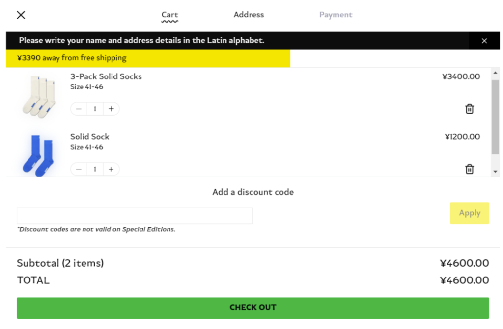
One of the biggest turn-offs for customers during checkout is encountering unexpected costs, such as shipping fees or taxes, at the last minute. To address this issue, businesses can be transparent upfront by clearly stating all costs associated with the purchase early in the shopping journey. Offering free shipping thresholds or providing shipping calculators can also help manage customer expectations.
Complicated Forms:
Lengthy and complicated checkout forms can deter customers from completing their purchases. Simplifying forms by reducing the number of required fields and using auto-fill features can streamline the process and minimize friction. Remember, it is a great practice to collect only the data that you truly need. Implementing a guest checkout option or allowing social media login can further expedite the checkout experience for customers.
Security Concerns:
Security is a top priority for online shoppers, and any perceived risks can lead to cart abandonment. To alleviate concerns, businesses should prominently display trust signals, such as SSL certificates and secure payment icons, to reassure customers that their personal information is protected. Implementing robust security measures and offering secure payment options and gateways, like PaySprint, can also instil confidence in customers.
In the fast-paced world of e-commerce, the checkout experience stands as the ultimate make-or-break moment for online businesses. It’s where the rubber meets the road, where all the effort put into attracting customers and showcasing products culminates in a single click of the “complete purchase” button. From the seamless user interface design to the strategic leveraging of cognitive biases and emotional triggers, every aspect of the checkout process plays a vital role in shaping consumer behaviour and driving sales.
Why Every Small Business Needs a Growth Plan
Top 7 Decision-Making Tips for Managers
Scaling Your Business with PaySprint Wallet Balance Protection

